Redesigning Praxis Counseling website with a mobile-first approach to help clients easily connect and access resources on-the-go
The existing website wasn't optimized for mobile users, who made up 68% of traffic. Potential clients struggled to find contact information and understand services, leading to high bounce rates.
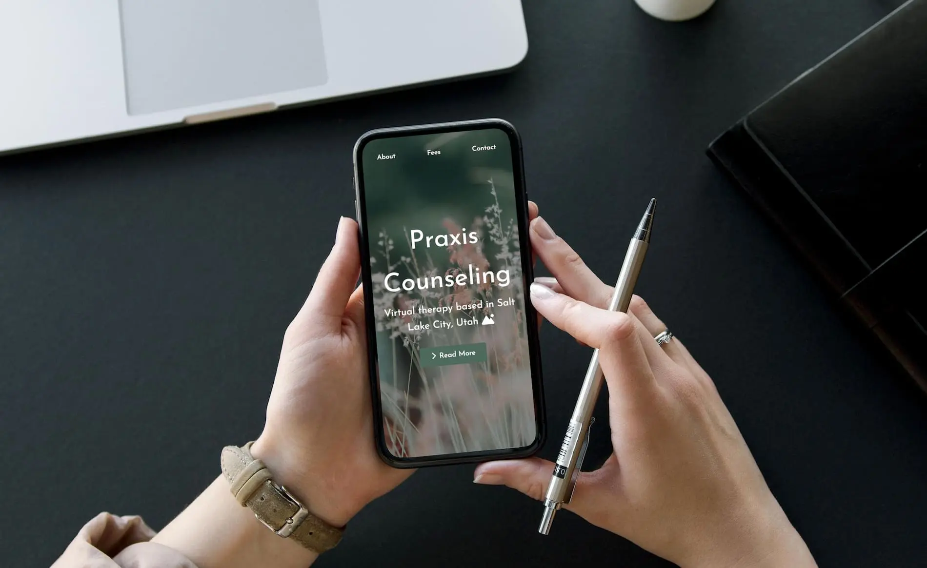
Created a mobile-first redesign that prioritizes ease of access to key actions: contacting the therapist, viewing services, and finding mental health resources. Implemented a calming, accessible design that builds trust and reduces friction.
Mobile bounce rate decreased by 42%, appointment bookings increased by 58%, and mobile session duration increased by 3.5 minutes. Client feedback praised the "easy to navigate" and "calming" mobile experience.
I worked with Praxis Counseling to determine what the user needs and pain points might be, as I couldn't interview any of their clients for confidentiality reasons. While navigating the site together, and through analytics data, we developed a list of goals and pain points of prospective clients when seeking therapy.
Working Professional Seeking Therapy
Potential Client is searching for a therapist during their work breaks, primarily on their phone. They need quick access to key information and are feeling stressed.
I designed for mobile first, ensuring the core experience worked beautifully on small screens before enhancing for larger displays.

Free Consultation

Background Overview

Crisis Resources
Every feature was designed to reduce friction and help users take action quickly and confidently.
Prominent display of therapy specializations helps users immediately know if the therapist can help their specific needs
Clear information about costs, insurance acceptance, and payment options upfront to reduce anxiety and uncertainty
Professional qualifications and experience prominently featured to build trust and credibility
WCAG AA compliant with screen reader support, high contrast mode, and keyboard navigation
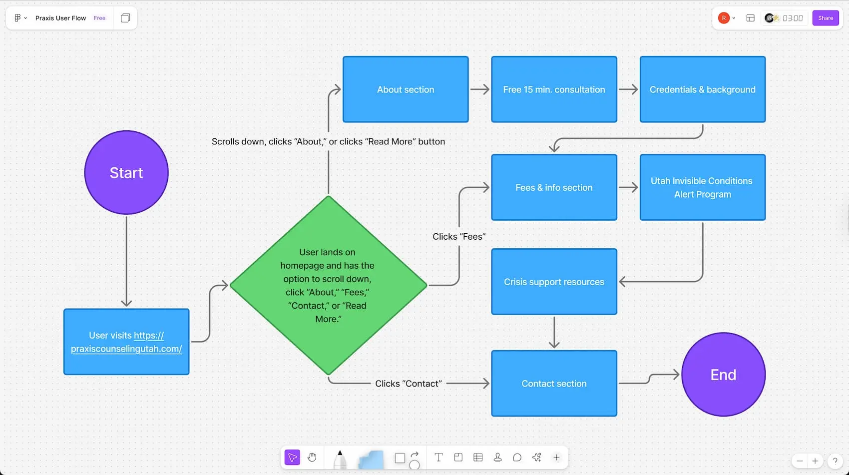
FigJam file showing Praxis Counseling user flow
Built with modern web technologies for optimal performance and user experience across all devices.
Used Figma for component-based architecture and CSS for variables and responsive styling. This combination allowed for rapid development while maintaining consistent design.
Achieved excellent performance scores through careful optimization of assets and code splitting for faster initial load times.
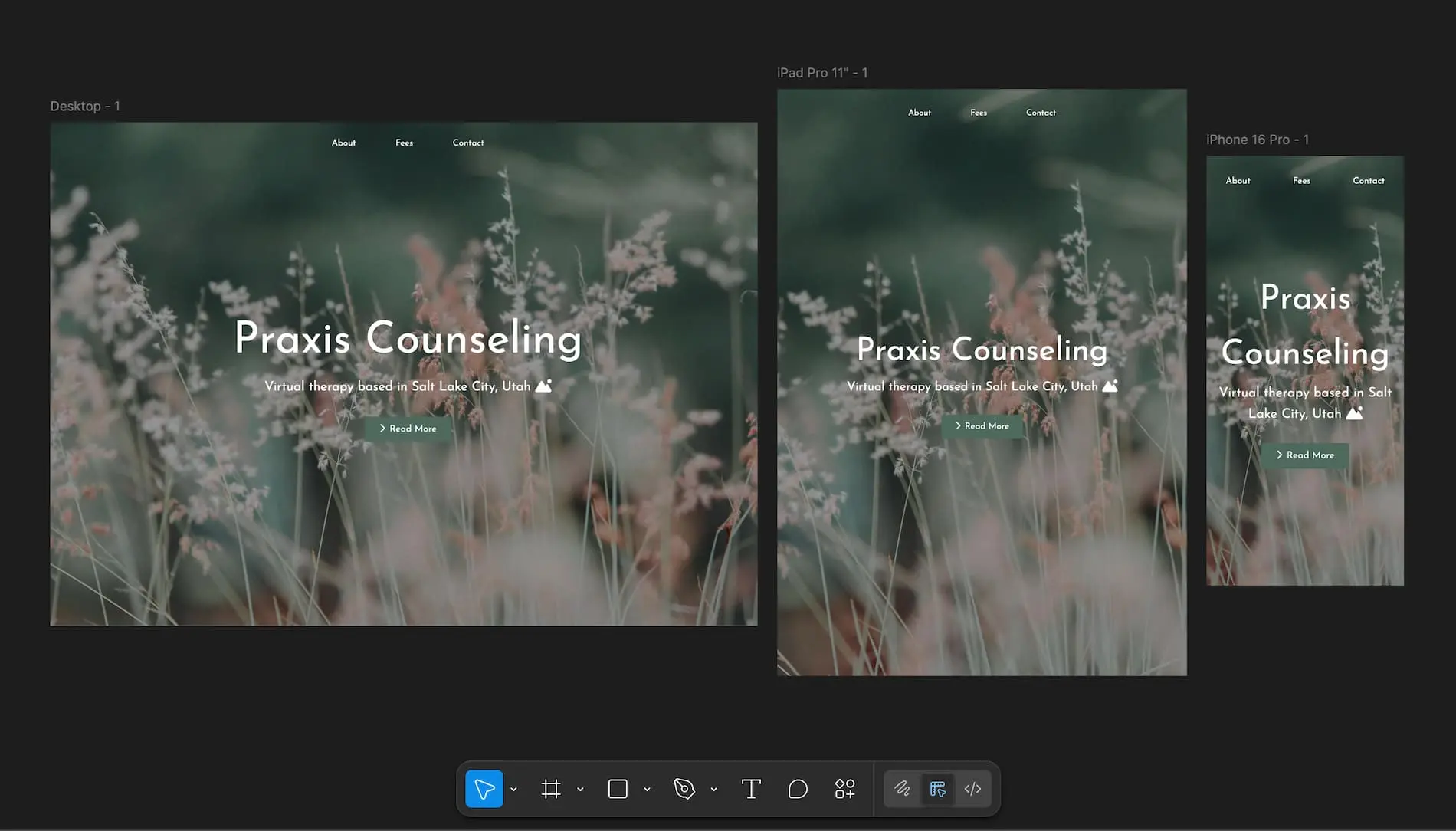
Responsive screen sizes mockup in Figma
The mobile-first redesign dramatically improved user engagement and conversion rates, making it easier for people to get the help they need.
This project reinforced the importance of designing for real user needs and contexts, not just aesthetic preferences.

User testing sessions with coworkers and friends helped validate design decisions and identify areas for improvement
Based on initial success and user feedback, there are several opportunities to further improve the experience.
Add real-time chat for immediate questions and concerns, reducing friction in the decision-making process
Develop a dedicated mobile app for existing clients to manage appointments, complete intake forms, and access resources
Build a searchable library of mental health articles, worksheets, and self-help tools for clients between sessions
Implement automated SMS and email reminders to reduce no-shows and help clients stay on track